GNSS Sky Plots
The SGF operates two IGS geodetic-quality, continuously operating, GNSS receivers; a Septentrio POLARX3ETR (International GPS Service (IGS) Station HERS) and a Leica GRX-1200GGPRO joint GPS/GLONASS receiver ( IGS Station HERT).
Station HERS contributes daily, 30-second RINEX data to IGS; Station HERT contributes both hourly and daily RINEX GPS/GLONASS data to IGS. The system is also being used to take part in the EUREF-IP realtime programme to stream data directly into the internet for rapid re-broadcast for general real-time navigational applications.
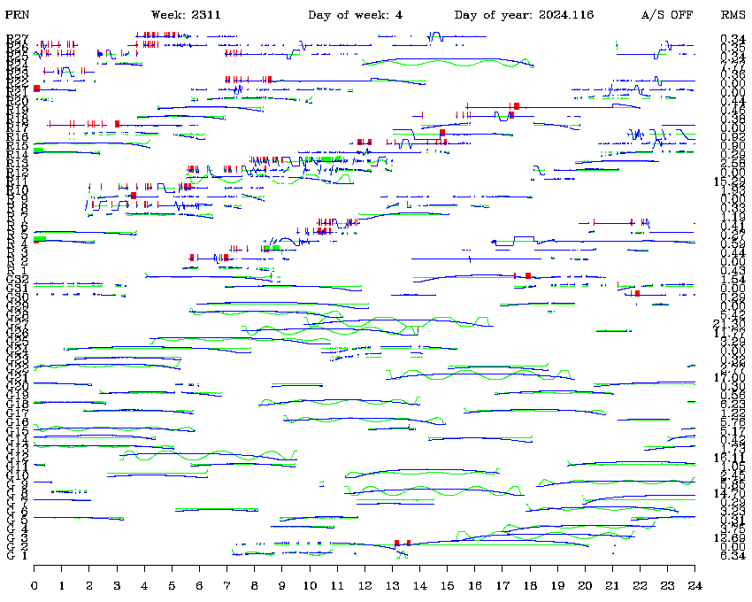
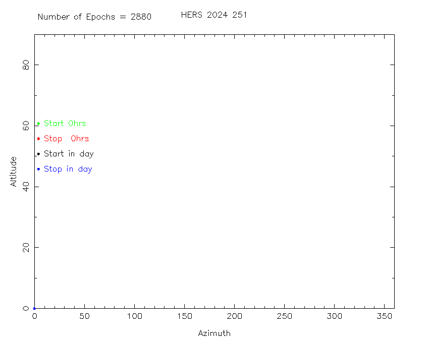
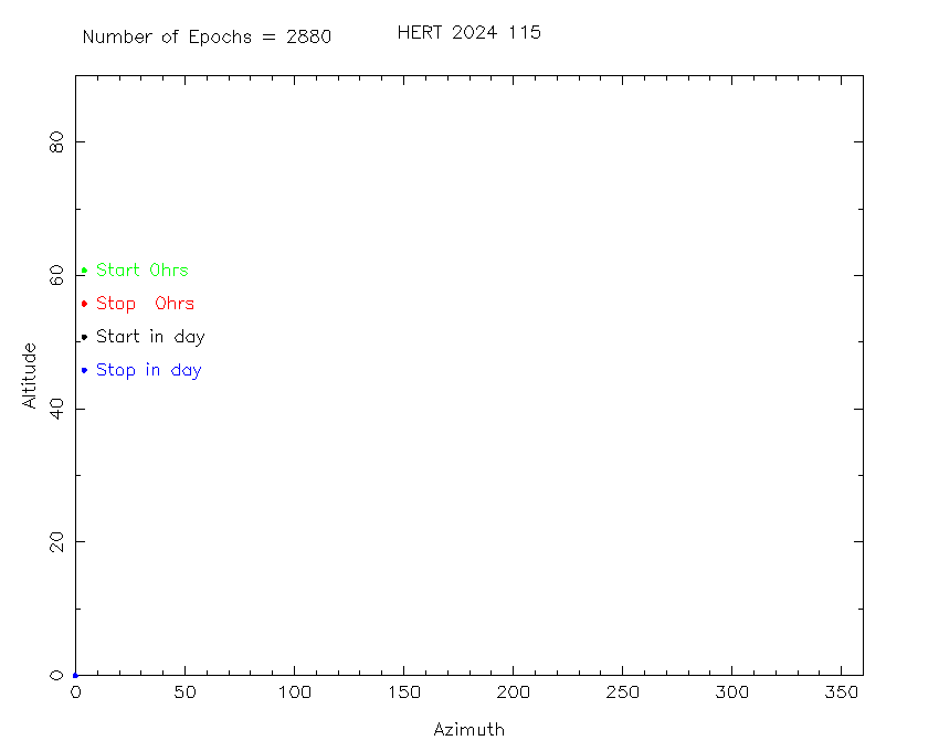
The quality of the data obtained by these receivers is monitored routinely via IGS coordinate and orbit determination solutions. However, every effort continues to be made on site to ensure the quality of the SGF data. Our QC analysis takes two forms: Firstly, from each daily, 30-second RINEX data file for the two receivers is extracted the times during which the GPS and GLONASS satellites are being tracked by the receivers. For each of these times, the local altitude and azimuth of the respective satellites are computed using approximate orbital elements. For each satellite, a 'sky map' is then plotted in a unique colour , GPS tracks as thin lines, GLONASS ones as thick lines. Visual inspection of the Z12 and Leica GRX plots then reveal any possible problems with breaks in tracking, local obscuration, etc.
Secondly, high-order polynomials are fitted to and removed from the range-type observables for each satellite pass from the two daily RINEX files. This process, originally designed and implemented by Andrew Sinclair, removes the varying range signatures and thus reveals random variations in range that may be indicative of system problems. The program reads the quantities P1-code pseudo range and L1 phase and it analyses the quantities F1 = P1-code pseudo range and F2 = L1 phase - P1-code pseudo range.
A polynomial is fitted to and removed from F1. The quantity F2 is taken as the difference of the phase and the pseudo-range, to remove the range-like signature and to cancel the dither. The quantities F1 (with polynomials removed) and F2 are plotted on top of each other in GREEN and BLUE resp. F1 is the rapidly varying quantity, showing the dither, and F2 is the smoothly varying curve. The vertical bars on the plots mark discontinuities in the phase data where tracking was lost. As an indication of scale, these vertical bars are equivalent to 25 metres on the scale that the dither is plotted, and 6 metres on the scale that the phase is plotted.